
|

|

|

|

|

|

|

|

|

|

|

|
|
|
|
|
|
|
|
|
|
|
|
|
|
|
|
|
|
|
|
|
|
|
|
|
Q: What have you done on this project?
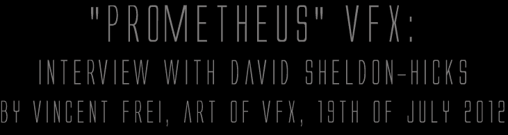
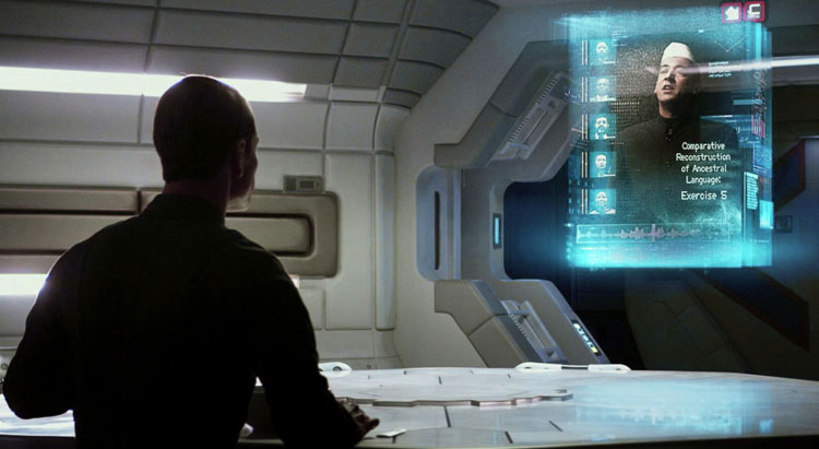
A: We collaborated with George Simons and Shaun Yue on the overall look for screens on the bridge of Prometheus. We were also responsible for the design and animation of screens in the medical area, social area, escape pods, some of the Rover vehicle screens. We also solely completed post screens for Cryo Pod, DNA tablets and screens, Helmet Cam HUDs and load of other stuff. Around 250 designs and animations to go on-set. We then handed over these animations to the very clever people at Compuhire, headed up by Mark Jordan, who's engineers and technicians made sure it was all physically run through to the set and worked with the rest of the art departments designs.
Q: What was Ridley's approach about the screen graphics?
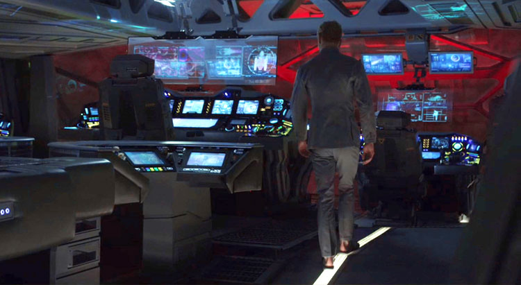
A: He wanted a more high tech look to the screens in this film from the original ALIEN film. This ship was meant to feel much more advanced as it represented an expensive research facility. Designs for screens in the medical areas and to some degree the bridge used node tree's like you'd see in Nuke or Flame UI's. This came from Ridleys reference of under water coral reefs and complex organic natural forms.
The social areas Ridley proposed abstract fine artists such as Paul Klee. We created abstract animations, that were meant to stimulate the crews mood and emotions. We’d take nutritional data of the food the crew were eating, and abstract the data so much it became much more suggestive and emotive layered textures.
In the more functional areas such as lifts and corridors we took reference from Ron Cobbs original functional designs in ALIEN. Bright yellow dials, data and warning info was displayed in bold, isometric frameworks to convey a more utilitarian and functional aesthetic.
Q: Which references and indications did he give to you?
A: It was really varied as mentioned. Ridley would talk at length about ideas that were being used throughout the art department, maybe a texture or form being used in part of the engineers head, or a pottery design to go in the eating area as a springboard for our computer interface concepts. Sonja Klaus would also be a great part of the process suggesting materials going into the surrounding consoles, tables chairs and other furnishings that could inspire our own views.
Q: How did you approach this project?
A: With a very hard work ethic! We always start with research. Based on that visual exploration we start to version out many, many designs. Once we’ve explored these designs as best we can we get to work on all the 2d and 3d animation. At all points through this process we're thinking about how we can best convey relevant narrative purely through quite technical data visualisations and 3d imagery. Its this pride and focus on the content that we take very seriously.
Q: Did you take some stuffs and references from ALIEN for the screen design?
A: We couldn't help but be aware of the original ALIEN film in working on PROMETHEUS. Everyone in our team trained as graphic designers so knew of the original title sequence and designs of Ron Cobb which are both timeless and beautiful. We sneaked in little elements here and there such as bold crosshairs in the corners of screens, and simple iconography design throughout.
Q: The various screens features a lot of informations. Can you tell us more about the screen content concepts and their creation such as the cryo-pod?
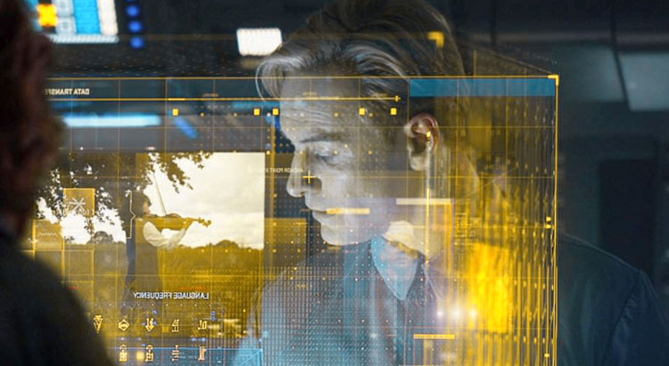
A: We created the HUD display for the cryo-pod late in production as a post shot. We were given the background plate and told to make something cool that would feature the name of the person asleep in the cryo-pod. Briefs for the UI work were always fairly loose, letting the script dictate key plot points for the content.
The rushes we were sent to add our UI graphics to had the character David wearing a funky yellow visor helmet, doing something with the interface on the surface of the glass window, monitoring Shaw's dreams. Quite a fun one this as it's not your typical computer readout on a science research space ship!
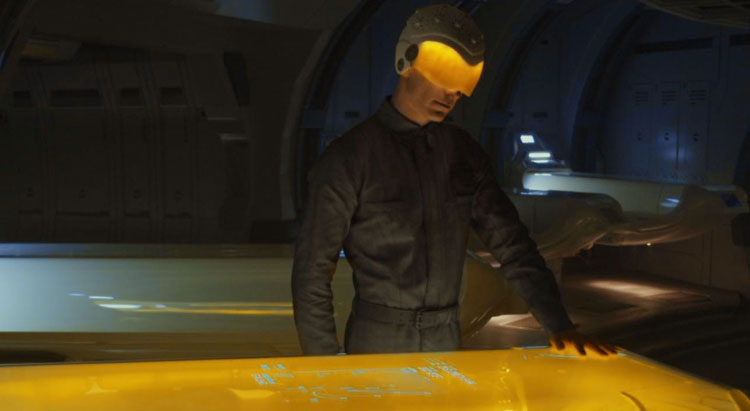
We sketched out a bunch of different ideas. Maybe we could see the dreams as fragments of images or represent the dreams with a series of abstract shapes and patterns. We talked through the ideas and realised we wanted the system to look as though it's purely monitoring the person inside, as it's David's Visor that ultimately gives the view into the dream. We wanted the interface to come from the same graphic language we'd already put in place for the medical area. We used floating control points for David to interact with, and there movements influenced tendrils that connected back to the main interface. We had sensors float over the person, taking measurements, again connected by tendril/node cables. Small amounts of data would flow around the screen, creating a route and logic to the system and processing of information. In the end we were really pleased with how this UI turned out. It's a great example of the organic style we developed and used throughout every screen and HUD in his film.
Q: How did you help the actors to interacts with the screen contents on-set?
A: Most of our screens weren't post so they could see and interact with them for real. We got a really good reaction from the actors because of this. We didn't get the issue of the actors looking at the wrong point on a glass screen projection, because the Compuhire guys did it for real on-set. It looked great.
Q: Which softwares did you used to create your screen graphics shots?
A: Photoshop and Illustrator for designs. Then into Cinema 4D and After Effects for animation. We also created our own in-house tools for some of the animation node systems.
Q: What was the biggest challenge on this project and how did you achieve it?
A: The biggest challenge was technically achieving the node based operating system we had devised. We wanted the computer graphics to use lots of connected lines, almost like cables or tentacles. The movements and shapes of these node lines would be affected by the steady undulating rhythm of tabs, windows and widgets. To create these nodes strands in the way we wanted in After Effects proved to be a little tricky. In-fact, at the time, we couldn't find a plugin or work-around that would make it work. We had the option of going into 3d which would have worked, but based on our timelines wasn't practical. In the end a good friend, Carl Fairweather, built us a plugin that gave us the solution. We had lots of Bezier handle controls that we could parent and weight to other objects movements. All our motion designers loved it and he developed it further as we started asking for more features.
Q: Was there a shot or a sequence that prevented you from sleep?
A: Most of them. Seeing your work on a large cinema screen knowing lots of people are viewing it, and its for a film by Ridley from a classic film franchise. Doesn't get much bigger and pressured than that. We didn't tend to have much time for sleep anyway!